2 thoughts on “Assignment 4B- Ecommerce Design Mock-ups”
I really like the use of bright greens and pinks throughout the design. This is really a nice design. I don’t know the first thing about coding and building a functioning website but may I make a suggestion? The idea and the colors are so vivid and fun, maybe the layout could be as well. Take a look at some more grids for examples. http://daniellesdooodles.wordpress.com/2012/10/15/magazine-project-week-6/
I believe they are magazine layouts but the idea is the same. There are so many fun ways to arrange your text and graphics.
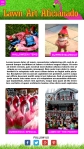
The bright colors really grab ones attention, not sure about all the text you have squeezed into the mobile layout, I think it might be too much making it hard to read. Maybe try just having the pics with a summarized statement under them. Also there is a lot of white space and would like to see it filled up with more bright colors.
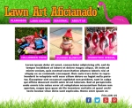

I really like the use of bright greens and pinks throughout the design. This is really a nice design. I don’t know the first thing about coding and building a functioning website but may I make a suggestion? The idea and the colors are so vivid and fun, maybe the layout could be as well. Take a look at some more grids for examples.
http://daniellesdooodles.wordpress.com/2012/10/15/magazine-project-week-6/
I believe they are magazine layouts but the idea is the same. There are so many fun ways to arrange your text and graphics.
The bright colors really grab ones attention, not sure about all the text you have squeezed into the mobile layout, I think it might be too much making it hard to read. Maybe try just having the pics with a summarized statement under them. Also there is a lot of white space and would like to see it filled up with more bright colors.